Learn how you can Unlock Limitless Customer Lifetime Value with CleverTap’s All-in-One Customer Engagement Platform.

You might think that the only presence your app needs is on the app store and your only strategy is app store optimization, and that’s it.
But the truth is: you will need a central hub for marketing your app, a place that can help grow your app’s audience by creating a sense of excitement around it. This is the reason that every app needs an effective, well-designed mobile app landing page.
The mobile app landing page is specifically made for promoting your mobile app. It should describe your app’s features and value proposition so that visitors are enticed to click through, download, and install. Your app’s landing page is a point-of-entry and starts out the user journey.
Because this is the first contact between your brand and a potential customer, the landing page for mobile app must be crystal clear about what problem your app solves. This may be your only chance to convince visitors to try it. And first impressions count!
This means you need to design app landing pages not just for the web. You should also have responsive landing pages that adapt to the device the reader is using, and that excludes extraneous content when a user is on mobile.
Hosting your app’s landing page on your business website can significantly enhance online traffic and bolster brand visibility, trust, lead retention, and profits.
App landing pages serve several crucial functions:
What elements go into a traditional app landing page template? If you go through the examples in this article and even investigate the landing pages of your favorite apps, you’ll discover there are five basic elements:
The reason your app landing page exists is to push the reader to the call-to-action (CTA), which should be to click the download button that sends them to the app store. Or to complete a contact form and then get the app directly.
All the elements on the page should support this ultimate goal.
Whether you’re using a button, a form, or a text link, this CTA is the single most important element your landing page needs. It’s the mechanism that turns a casual viewer into a customer or a lead in all the best app landing pages.
Next up in importance is your headline. It’s the first thing the reader sees.
Make sure it communicates the value of your app. It doesn’t have to be witty or clever. It just has to drive the point home that the reader needs your app. Or at least intrigue the reader enough to stay on the page.
Check out how Pzizz, a sleeping app, explains the entire value of their app with the headline. And immediately under, their call-to-action buttons. The social proof from Roy Hibbert is a nice touch that adds celebrity clout.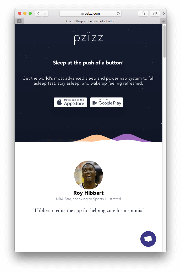
The main body copy is where you expand on your value proposition and benefits. You need to provide as much copy as will answer a reader’s unspoken questions and satisfy why they were motivated to get to your landing page in the first place.
But the length of your copy will entirely depend on your app and the industry you’re in. Getting them to purchase an endless runner game will require much less copy (and more images) than, say, a dieting and healthy lifestyle app.
You will also need some sort of social proof. Some way for the reader to see that your app is trustworthy.
Typically, apps will showcase glowing user reviews or testimonials from big name customers. They will display the app’s awards or recognitions, if any. Or simply boast about number of downloads, or number of users.
Take a look at how Roadtrippers, a map and travel app, uses both its body copy and its user reviews to tell a story about finding hidden gems on your road trips.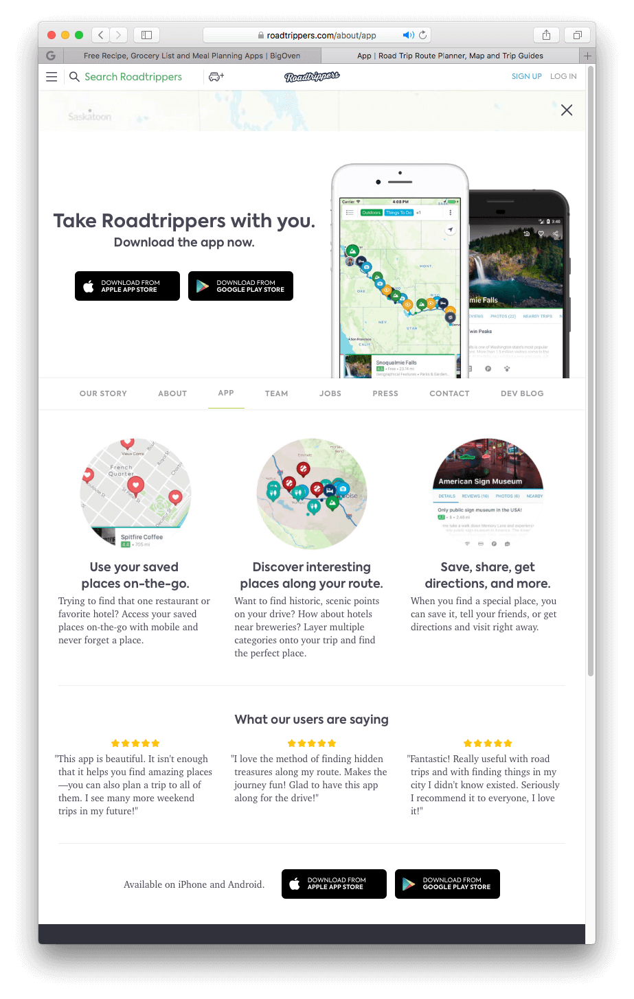
The final element of any app landing page is the stuff that makes it stand out: the visuals. These are your chosen images or videos elements that add eye candy to your page.
The goal of your visuals is not to build beautiful app landing pages, the goal is to enhance the story that the body copy tells. They should showcase the product and its benefits.
A great example of some attractive media is the Soundcloud’s mobile app landing page, which uses animated GIFs to show how easy it is to scroll to find new music and microinteractions to engage the reader.
Your objective is to create mobile app landing page efficiency – to move potential users more quickly toward the business goal.
Below are some best practices illustrated by mobile app landing page examples that aid in optimizing your app’s landing page.
Takeaway: Keep text short!
Because: attention spans.
Only keep body copy that adds value to the page and take out the filler. Use bullet points to drive home the essential information. And for goodness’ sake, if you’re selling a non-technical product or service, cut away the jargon!
Check out the app landing page for Keeply. Above the fold, it only lists its value proposition, and nothing more. The remaining details are below the fold, all amounting to five phrases (not even full sentences), with each phrase next to a compelling screenshot.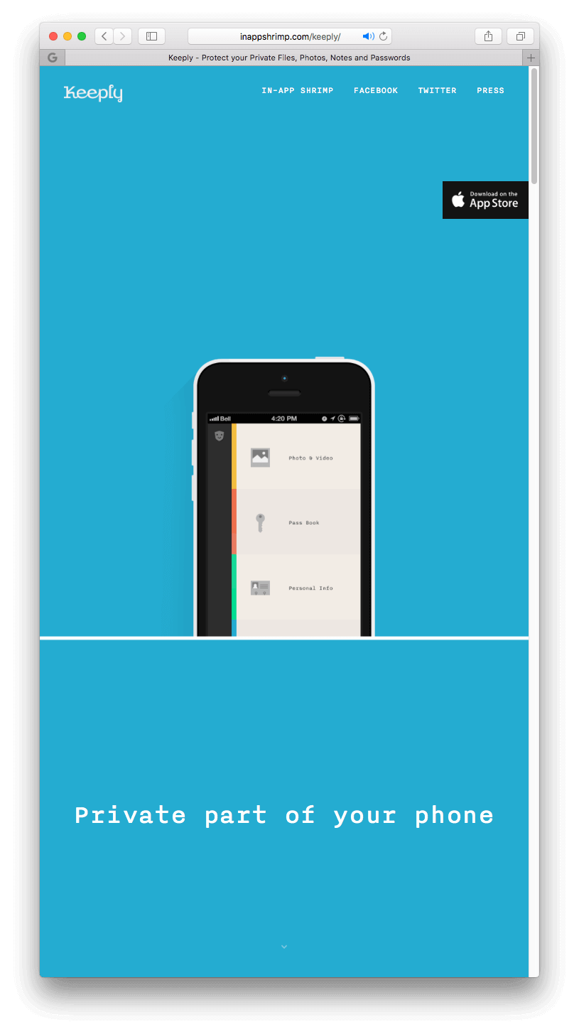
Takeaway: Lower the barrier to entry
In other words, make it easy for users to click that CTA button. In practice, if your app landing page has a contact form, make sure it is as short as possible. Or if there is text, don’t make them scroll through an endless stream of words before they can click.
One of the simplest landing pages around is for the gaming app Crossy Road. All it is is a bunch of in-game screenshots, download links, and some awards for social proof down at the bottom. No need for fancy text. The point being: here’s what the game looks like, now download it!
Takeaway: Make text legible
Alongside brevity, you must use fonts that are readable. Use large sizes. Make sure words are easy to see on mobile devices with smaller screens. According to UX best practices, fonts should be readable an arm’s length away. [LINK to UX infographic post]
See the app landing page for BigOven. Large sizes for the header text make the point extra clear to anyone even several feet away. Added bonus: even just reading the headers without reading the bullet points or body text, you immediately grasp the benefit the app provides.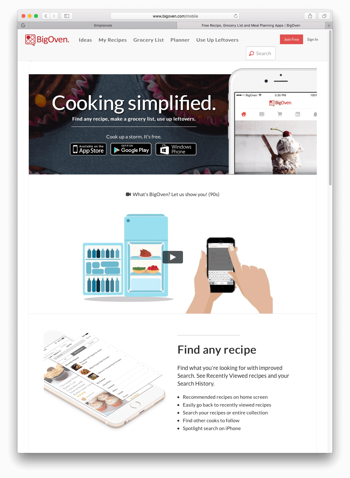
Takeaway: Tell them why they should download
Explain the benefits of your app and the problems it solves. If you can sell them on the value proposition early enough, you can convert them into a customer quickly. Remember: the simpler, the better!
In Hotel Tonight’s mobile app landing page, they explain the value you get and the simple process to start using the app immediately.
Takeaway: Draw attention to the CTA
It’s no coincidence that Amazon made all their CTA buttons orange. They tested everything and found that the color made their buy now buttons stand out.
You can draw attention to the CTA by A/B testing various elements such as color, size, font, or placement. The point being: find out which elements make your own CTA buttons or text links irresistible to your readers!
In the Standard Notes app landing page, their designer decided to use the brand colors for the download buttons, giving the page the only real color, apart from screenshots down at the bottom. And since they’re smack-dab in the middle of the page, you have no choice but to notice their CTA buttons.
Takeaway: Design for thumbs
In your mobile app landing page design, ensure your tap targets (the area on the page that the user interacts with) are large enough and don’t overlap one another. According to an MIT study, the average finger pad is 16-20 mm wide. [01]
Take a look at the Simplenote mobile app landing page. First off, you get an overview of what the app does, and immediately have a download link for each OS. Notice how large each download link is. That’s intentional to make it easy to click while on mobile.
Takeaway: Look Forward to Truly Interactive Pages
Up to this point, we’ve been talking about traditional, and mostly static pages. However, a new type of page is already in place that is using the most interactive of all user experiences: chat.
In some quarters, it’s being called the “conversational landing page.” They solve some of the most nagging problems with static pages: these are optimized for mobile devices, they’re intuitive to use, and they’re immediately engaging.
Check out the animated screenshot below from Tars. [02]
Design plays a large role when you choose to create mobile app landing page engagement. The point is to use every element to get visitors to download your app. If your pages aren’t converting, then you need to test every element and find what works best for your audience.
Here are two more resources that should help you in your quest for the ultimate download-driving landing page:
Mastering Mobile App Engagement & Retention